DataMath is hard!
What the heck am I looking at?
Here's some help on reading the eye candy on the Device info page. If you don't see the popup that's because you aren't hovering on the data or haven't "touched" the box on mobile devices.
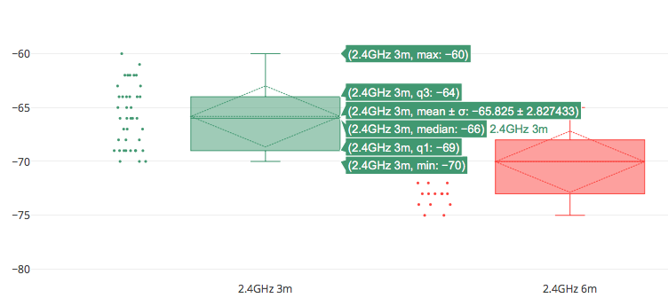
The dots on the left hand side represent each of the individual measurements that have been uploaded into the database.
Understanding the right hand of the chart is a little more complex. If you take those data points and draw them on a single line the first step is finding the median, where we have equal numbers of points of the data set either smaller or larger. Now divide each half of the dataset again thus creating four even sets of data points, these are called quartiles. The bottom most line of the box represents the first quartile (q1) while the top most line of the box represents the third quartile (q3). The median is also know as the second quartile (q2).
The whiskers, or lines outside the boxes, represent the outliers. We first calculate the interquartile range (IQR) which is the box or distance between q1 and q3. Now we take another subset of the data set which ranges from 1.5 x IQR below q1 or above q3. The whiskers are drawn at the smallest and largest point within that subset.
The diamond shows the mean, and +- 1 standard deviation away from it. If the diamond is outside the box it implies a wider range of data while the diamond inside the box implies a narrower range. The hope is for consistency and a narrower range of values.
So which value do I use?
Well, that is a good question! It depends on what you want to represent. Do you want to show the data as the worse known device test or the best
or somewhere in between? That is why we present the data to you how we do, you need to decide what is the best for your use case!
MeasuringWhat apps can I use?
NIC-300 (Windows) / SA1 (Windows) / Sidekick (macOS / Windows)
Testing your NIC-300's or Sidekick requires you to use Ekahau. We recommend limiting the channel scan configuration to just your channels from your test AP.
Once you have the channel configuration setup simply use the RTFM tool to view your network and RSSI values.
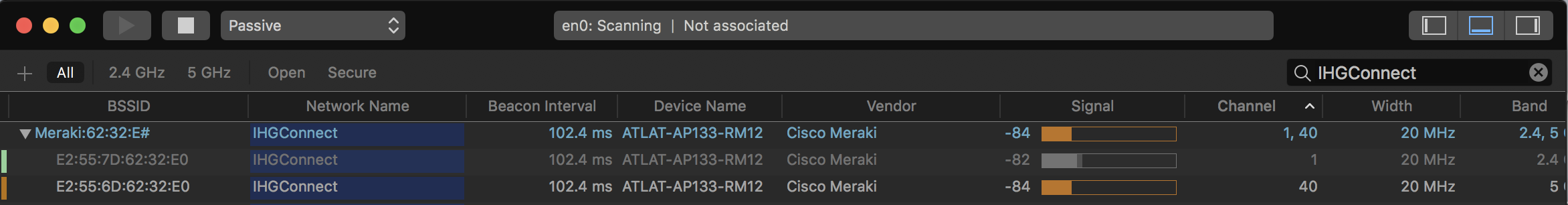
macOS
For all measurements from macOS we recommend WiFi Explorer from Adrian Granados. The Standard version for $19.99 will work just fine and also support a fellow
developer that does amazing work for the community! You can filter your scan results to show only your network and RSSI values.
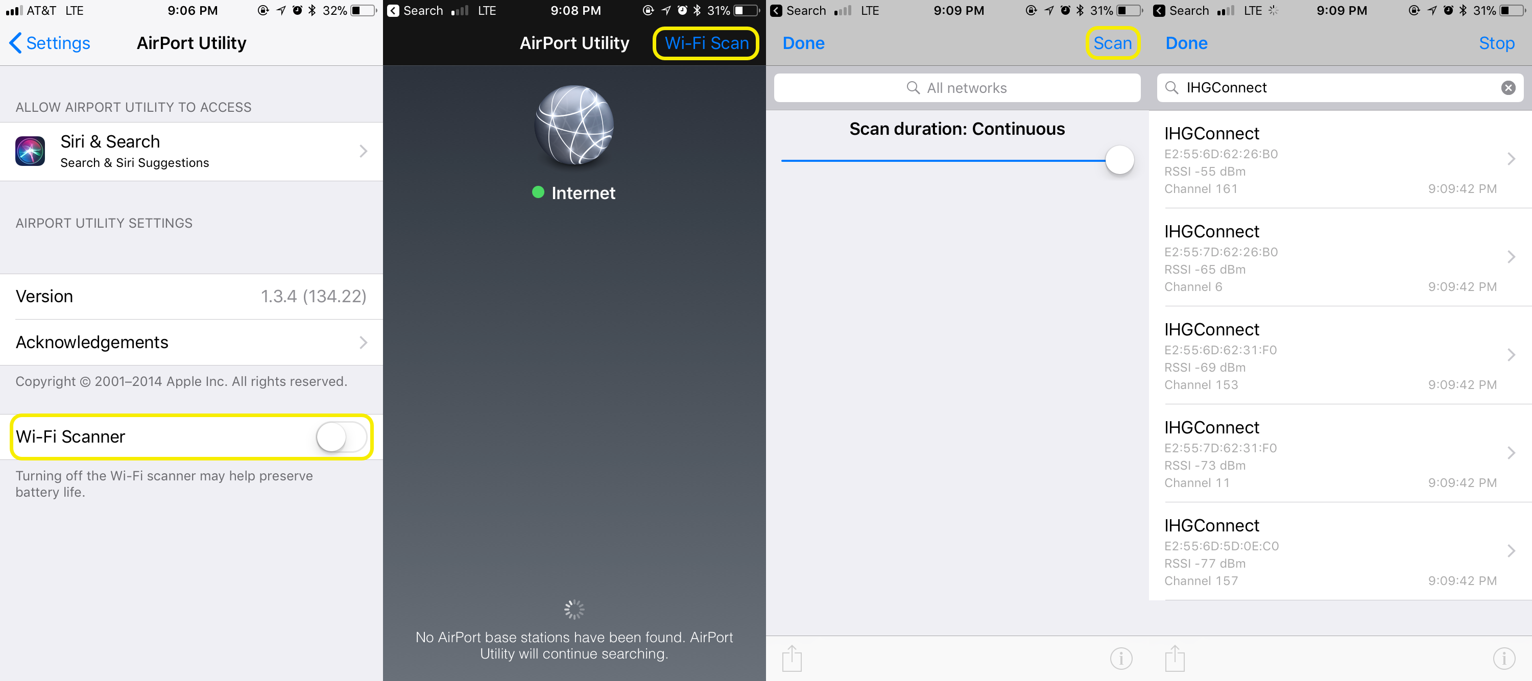
iOS
Because of how Apple handles the APIs for retreiving RSSI values there really aren't many options. The one that seems to work the best is the
Apple Airport Utility which you can download from the App Store. Once installed go to Settings -> Airport Utility Configuration and enable Wi-Fi Scanner.
Launch the Airport Utility application and click on Wi-Fi Scan in the upper right hand corner. Enter in your network name from the search box and click
Scan. You'll now be able to see your RSSI values in a continuous scan loop. When you are done remember to go back to Settings -> Airport Utility
Configuration and disable Wi-Fi Scanner to conserve battery.
Android
Android provides a lot of options for retreiving the RSSI values, we have used with good success WiFi Analyzer by VREM
which is available on the Play Store. You can filter your scan results to show only your network and RSSI values.
Windows
If you are running Windows there is an application that is similar to WiFi Explorer called Acrylic WiFi Home that allows you
to retreive the RSSI values. You can filter the results as well to show only your network and RSSI values.
SocialDo I need an account?
Why would I link to my social account?
By logging in with a social account you will be able to see all of the past results that you have entered. This would allow you to remove a measurement if you determined your adapter
was faulty for example. In the future we might use social for more aspects but for now it just allows you to see all of your measurements you recorded.